Wednesday, July 9, 2008

Blog Inspiration

I like this blog (and the rest of the site) quite a bit: http://zand2ohs.com/fun/. My favorite part of the page is the image preview/review for navigating through the entries.


I found this site via the July 2008 issue of Communication Arts (Illustration Annual 49).

Friday, June 27, 2008

Flash Inspiration

Class ended quite a while ago... but I still feel the urge to share this awesome website here: http://christiansparrow.com/.


I found it via Craig Campbell's School of Flash (which I just used as a reference for building a simple preloader on Kira Elizabeth's website).

I plan to continue to utilize this site for posting future projects, other sources of inspiration, and whatever other design-related content I can create! I might eventually move this stuff to amy-berg.com, as a more permanent home. Stay tuned!

Wednesday, May 14, 2008

Polymer Plate Printing & Final

Images of Polymer Plates

Munchkin Kitty Proofs

Lining Up Paper for Print

Lots of Kitties!
Lots of Kitties!

One of the Best Prints
One of the Best Prints (some day I'll scan a print)

Sunday, May 4, 2008

Crash Printing

@ mcneal


On Thursday I completed my "crash printing" assignment. I designed two prints using plates from the Bell Museum of Natural History's archives (from Francie Lee Jacques and Walter Breckenridge) and experimented with typesetting. I was so into it (and my hands were so covered in ink, anyway) that I forgot to take photos during the inking (pulling out the ink and applying it to my plates with a brayer) and pressing process. The photos below are my layouts and results.

@ mcneal

0501080941.jpg

@ mcneal

@ mcneal

@ mcneal

Tuesday, April 15, 2008

Polymer Plate Images

This is what my final image will/is supposed to look like (after letterpressing):


Here is how my colors split:


So, unless I decide to make any other changes (more drastic stroke around the Munchkin? tail entwined with the DNA double-helix? any thoughts?) - I think I'm good to go!

Monday, April 14, 2008

Polymer Plate Ideas

"Custom Made"


When I started thinking about a simple two-color design I could create in relation to the phrase "custom made," I thought about furniture and clothes and kitchen cabinetry... All very domestic things, but perhaps not such interesting illustrations. Then I began trying to think about "custom made" in relation to the place where I work, the Bell Museum of Natural History. Images of dioramas and taxidermy came to mind, but then I thought: natural selection. Of course, natural selection isn't exactly customized - so I opted for something more along the lines of trait selection.


Munchkin cats are bred for their short legs, which is actually a genetic mutation. Some professional cat registries don't recognize this breed (for show) for that reason.

My design incorporates an illustration of a Munchkin cat and a DNA double-helix. I will be editing this design to incorporate "custom made" more organically - the words might form the links between the two strands of DNA. "Couture cat" was a suggested label from a friend who is studying clothing design. I am still considering how to use this phrase, if I decide to keep it.

Wednesday, April 9, 2008

New Assignment: Polymer Plate Printing Project

For the next assignment, everyone in my class will be creating his or her own 4"x6" two-color design revolving around the theme of "-made." We were each assigned our own prefix - I was assigned "custom(-made)". Other examples that were assigned are: re-, hand-, and home-. We will be producing polymer plates with Boxcar Press and printing them on Vandercook letterpress machines (pictured below). In the end, we will be compiling our prints into books and each taking (at least) one home!


This assignment will be very fun - and an exciting break from the computer!

Monday, April 7, 2008

Series: Personal Critique

To be honest, I hit a creative wall with this assignment. Maybe there were too many other things happening at the same time, but as the due date neared, I couldn't find the mental energy to focus on this project as closely as I wanted. My products tags suffered the most as they were my last priority. Ultimately, however, I am pleased with the results. I think my final designs speak to who I am and my illustrative style. The pieces I've created are simple and attractive and might appeal to a wide audience. I feel like I could pick this project up again in the future and complete mat designs for other specific poses.

I'm also happy that I tried to design for product development as this is something I think I'd like to practice more in the future. This would be a good project to use as a critique in the future - what I learned on my own and what I could improve with further training.

Sunday, April 6, 2008

Series Development

Product tags are in place! I just need to refine them before printing tomorrow...


I'm looking forward to mounting and finishing tomorrow night. It will feel so gratifying!

Saturday, April 5, 2008

I can almost see it...

... if only it weren't for those darn product tags, for which I can't seem to find the brain power. Hopefully I will be smarter tomorrow!


This studio was photographed (with permission) at the Yoga Center of Minneapolis.

Tuesday, April 1, 2008

Product Design Progress

This is the last week I'll be spending time with this assignment. Class critique and final, mounted designs are due next Tuesday. Hopefully I'll be able to post my progress a couple more times this week because I have a lot of work ahead of me! Any feedback is greatly appreciated!

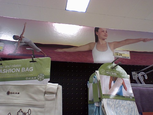
This past weekend I made some progress with putting my designs in context to yoga practice and retail display. My retail display contains two of my three major pieces for the series: the product tag and the display poster. The product tags (3 layouts for one specific pose/color to be developed this week) will contain the majority of my typographic design (health benefits, pose tips and, of course, pose name) and will be mounted on one board together. The display poster is important to show my pose illustration quality. I'm not sure if I should print this piece to scale or full size (24"x36" like my original yoga poster), but this piece may also be mounted on its own board. The contextual retail display (with final tag and poster designs applied) will also be mounted on its own board.

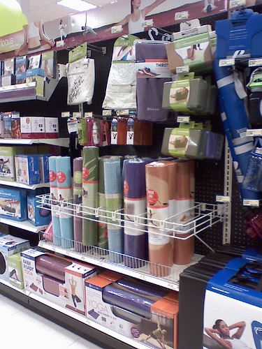
My yoga mat design is the third major piece of this series, though it is possibly the most important. This is, after all, where my ideas for this assignment began. I will be focusing on the same pose that I develop for my product tags (Fire Log Pose might be the best pose to work with) to create a more artistic and interesting mat design. In the illustrations to the left, I've laid the texture of a yoga mat under each design in order to further influence the design. I'm not sure if this is necessary or if it detracts from the design. Ultimately, the graphic I work with will be mounted on it's own board.

My last board will include my final mat design applied to a contextual image (as seen to the left) and perhaps my three other mats. I don't know if I'll develop them further, but perhaps they're necessary to show the overall grid system of my mat designs.

Wednesday, March 26, 2008

Yoga Series: Mat Development

I've decided on four poses to develop yoga mats and product signs for:

Here are the four yoga mats in progress:

Tuesday, March 25, 2008

Client Promotion: Final Draft

Natalie, Andy and I submitted a rough draft (March 13th version) to Theresa Nelson for her comments and mid-project critique. Today, we addressed all of her concerns and created our final draft.


Here is a photo of Natalie and Andy happily preparing our mat boards for mounting the final design:


On Thursday, the three projects that the class created will be formally presented to Theresa for further critique and possible use by the Midtown Greenway Coalition.

Progress with Client Promotion

Below are the brochure drafts that Natalie, Andy and I have created for the Midtown Greenway Coalition so far, by date:

March 6, 2008


March 12, 2008


March 13, 2008


Saturday, March 22, 2008

Client Promotion: Midtown Greenway Coalition

Natalie Olbrantz, Andy Garcia and I are working together to create a promotional piece for a client, the Midtown Greenway Coalition of Minneapolis, Minnesota. We discussed what sort of piece we wanted to create. Whatever we decided, our piece had to be easily reproducible and maintain elements of the client's visual identity. Theresa Nelson, the Greenspace and Art Programs Manager, distributed newsletters and referred us to a website (under production) that we could look to for inspiration.


We started by sketching ideas for a brochure with four panels (full size of 8.5"x14") or a brochure that would fold out as a poster (possible full size of 8.5"x11").

The four-panel brochure sketch:


The poster brochure sketch:


Ultimately we decided to design the four-panel brochure as we thought it would be easier to work with the information that we received from Theresa.

Friday, March 21, 2008

Product Series Design (in progress)


This is what my product display would look like in a retail store. The white blocks are tags I need to develop. I also need to refine the pose on the display sign.

Monday, March 10, 2008

Retail Store: Yoga Merchandise Display


Series Campaign Ideas

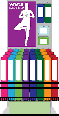
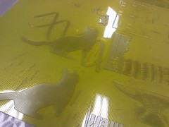
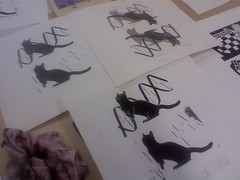
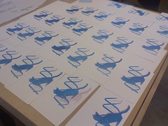
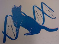
The idea that is inspiring my work in the series assignment is putting feet/hand prints on yoga mats for specific poses. Each mat could be color coordinated for various poses. The tag for each color/pose would define how the pose is helpful for health and serenity (try the "Cat Pose" or Marjaryasana which provides a gentle massage to the spine and belly organs in order to relieve stress).

To the right is a really rough sample of what the mat would look like rolled out. Other graphics I need to develop for the assignment are signs that would displayed on an end-cap in a retail store, the tag that would be attached to each mat (with UPC code?) and perhaps other wrap-around labels for the package mat (presale).